Be Better Than The Gap
It’s arguable that The Gap holds the record for the fastest brand turnarounds this industry has ever seen. The public chewed them up and spit them back out. And just as quickly as they upset their audience with their new logo, they reverted back to the original one. The Gap severely underestimated the equity built up in their brand’s visual identity. It’s never a bad idea for a company to rebrand or even opt for a digital facelift to get with the times; however, without thoughtful consideration, a rebrand could also serve as a brand’s death sentence.
It’s safe to assume that just about everyone knows who The Gap is, unless you live under a rock. Because of the company’s revered brand awareness, the failed rebrand, unfortunately, unfolded on a very public stage. In the fall of 2010, during the busiest retail season, The Gap launched its brand new logo with hopes to make waves. And they did. They made waves. But not in the way that they hoped for. Fortunately for us, The Gap’s rebrand is one of the best brand case studies our industry could possibly ask for. Ten years later, it remains more relevant than ever.
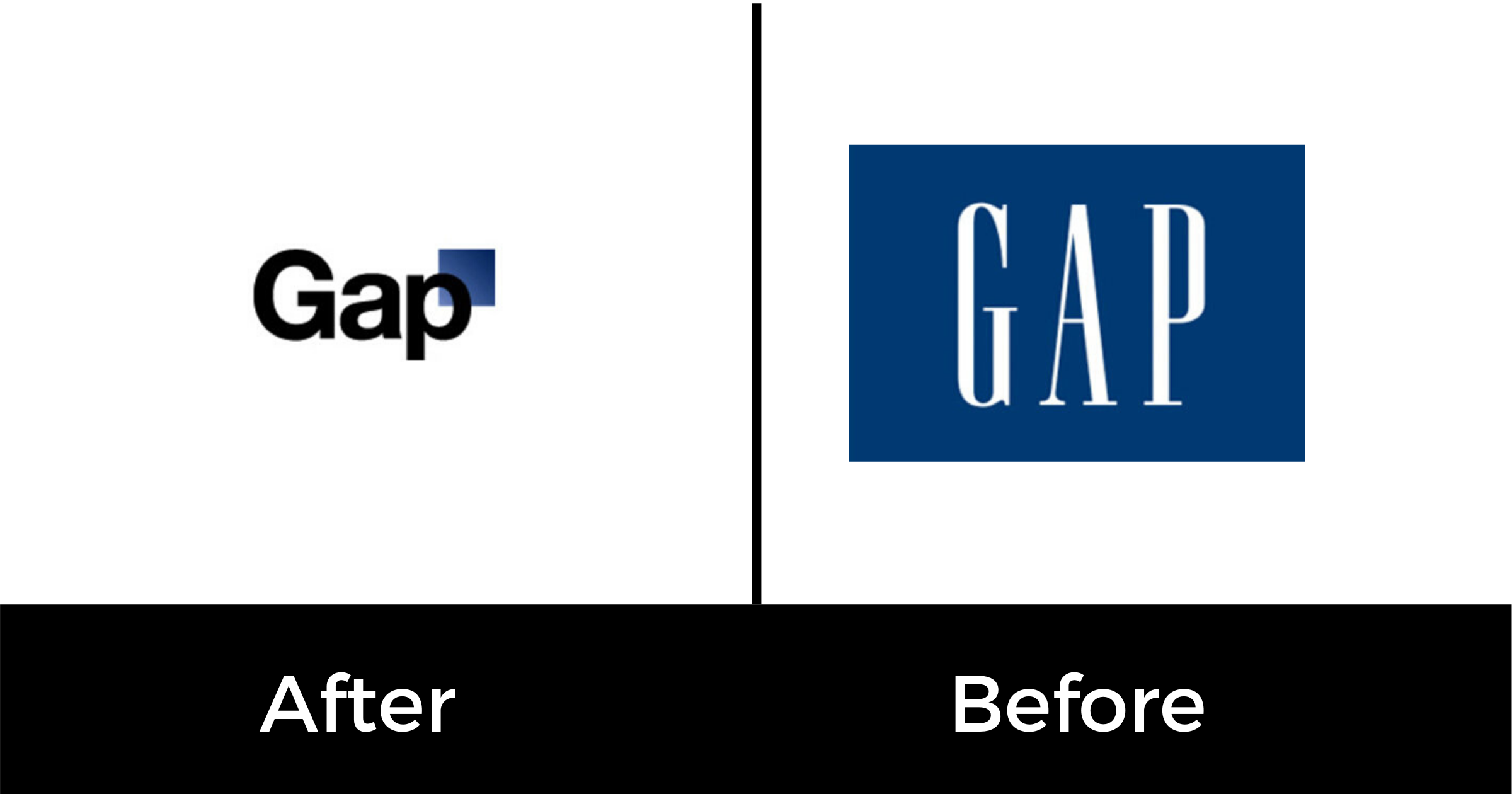
With no warning, The Gap unveiled a brand new logo and company rebrand; it’s first rebrand in over 24 years. Loyal costumers were uninformed that the familiar design was going to disappear and be replaced with a brand new design. Dissatisfied consumers and unimpressed design community members decidedly took to the internet to express their distaste with both the company’s execution and rebrand.
Could you blame them? The new logo looked like it was made for a local bank or a trustworthy medical group — definitely not a fashion brand.
And The Gap’s response sealed the fate of the company’s rebrand project. Gap informed its unhappy audience that the new logo was phase one of a crowdsourcing project that allowed the company to reinvent itself. Many had trouble believing that the new logo was truly the fruit of a strategically driven process. The company prematurely reacted to the original backlash by sharing excitement over the energy and passion consumers were expressing and further wanting to collaborate with them to create a new logo.
The U.S. clothing firm tried to enlist the help of the public in rethinking their design. This decision was accepted defeat. It is a fundamental error to rebrand without the knowledge of your customer’s willingness to grow with you. Within days of the overwhelming online outcry, the fashion brand admitted fault in not consulting with its customer base first and foremost. The Gap went back to what they knew and rekindled with their long-time logo that had proven to withstand the test of time.

Technically speaking, the design elements were cause for aversion. Overall reactions shared two common rejections referring to the Helvetica typeface (the same typeface as its competitor American Apparel) and the gradient navy box. Its worth mentioning that these were the only two changes made. The redesign was accused of being too generic. It turns out that playing it safe isn’t always the best solution and any press isn’t good press. In The Gap’s case, it was a terrible solution.
It’s no secret that The Gap isn’t at the forefront of new-age fashion and design. The Gap built its brand based on principles such as practicality, affordability, and sophistication. In past marketing efforts leading up to the rebrand, these principles were shared and expressed effectively. The rebrand marketing effort abandoned these foundational elements that made The Gap, The Gap. Without those brand identifiers, the brand lacked purpose and roots. With no direction or target, The Gap no longer felt familiar and understood to its target audience. The brand lost a lot of the trust that it had built in the 40 years leading up to the 2010 rebrand and just like a reputation, a brand takes years to build and minutes to ruin. Let this be a lesson to all.